墨尔本PTE Describe Image 图片描述 14
2015/06/01
墨尔本PTE Describe Image 图片描述 16
2015/06/01
Answer:
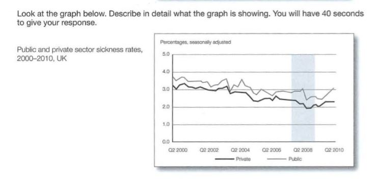
This image illustrates a line graph that talks about the public and private sector sickness rates in the UK from 2000 to 2010, in percentage form. In the period between 2000 and 2010, the public sector’s sickness rate has always been slightly higher than that of the private sector. However, both the public and private sector has seen a decrease in their sickness rate, with the public sector decreasing from around 3.7 percent in 2000 to 3.1 percent in 2010 while the private sector decreased from 3.2 percent in 2000 to over 2.3 percent in 2010.

