墨尔本PTE Describe Image 图片描述 05
2015/06/01
墨尔本PTE Describe Image 图片描述 07
2015/06/01
Answer:
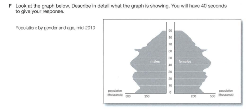
This image illustrates a demographic chart that highlights the population by gender and age in mid-2010, in thousands. Firstly, it is evident from the diagram that the chart has a symmetrical distribution between the males and females. Both have the highest population for people aged between 40 to 45, at almost 500,000. Also, both have approximately 400,000 people aged between 0-2. One difference is that there seems to be more females aged between 70 and 90 relative to males.

